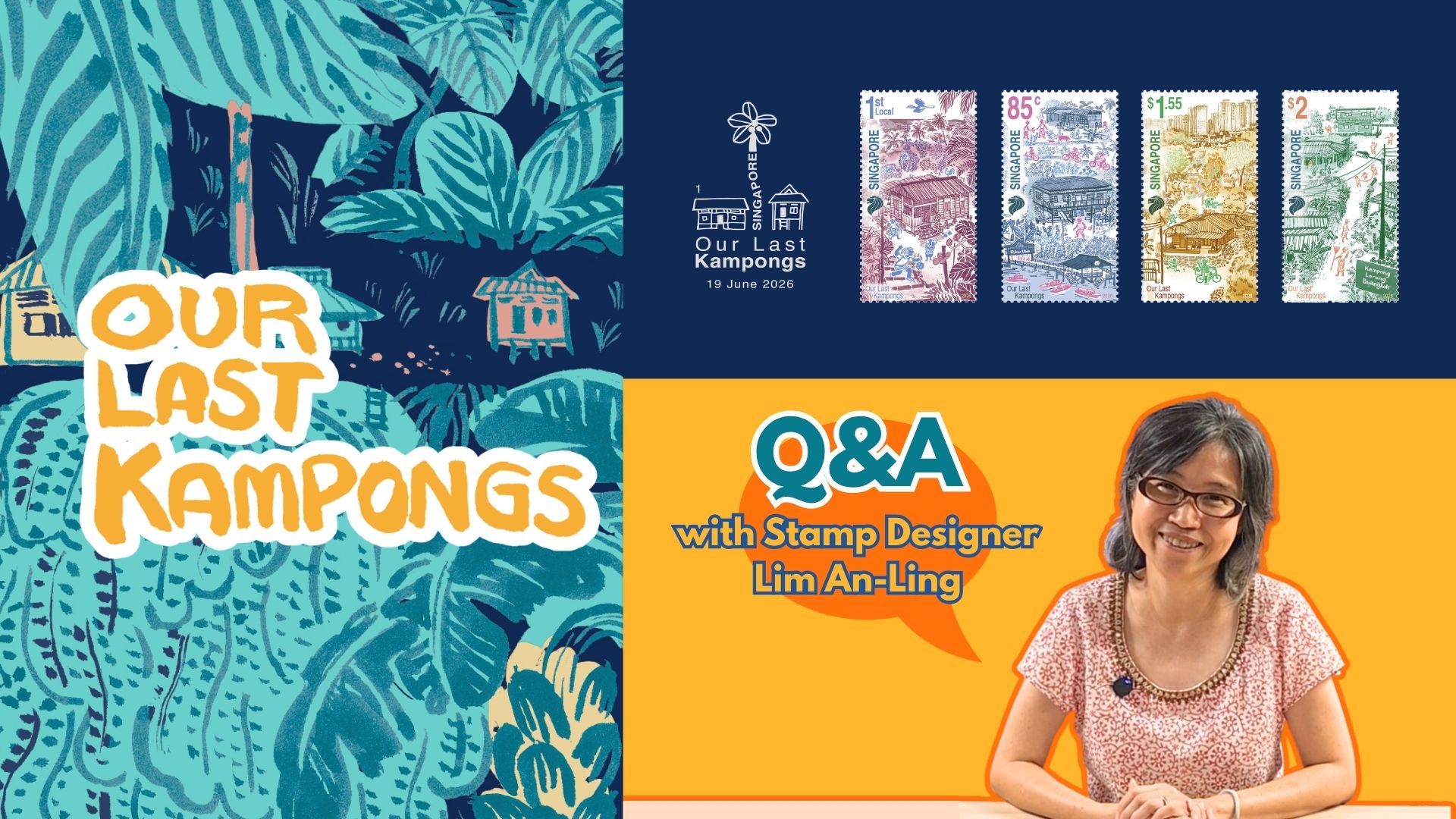
About the Designer
Lim An-ling is an animator / illustrator. She is a versatile artist who is interested in ways stories could be told through artwork. She believes in experimenting, and the wonders of pen and brush. Her years of experience working in production companies as an animator, contributes to the sense of movement in her illustrations. Through the years, she has illustrated for postage stamps, editorials, campaign and film collaterals, and wall murals.
What got you inspired for this series of Horoscope stamp designs?
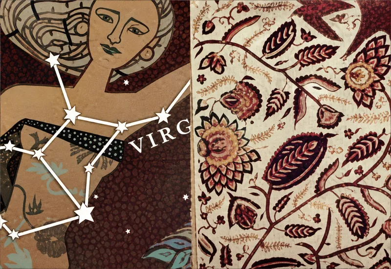
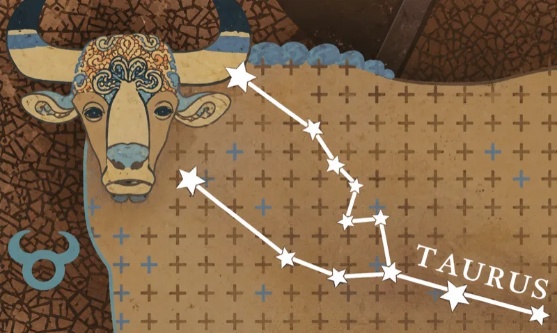
I based my inspiration on the idea of incorporating the Greek mythological elements into South-East Asia's elements. From there, the creatures start to take their Asiatic forms and are adorned with our South-East Asian motifs. For example the bull in Taurus is based on Gaur, an Indian Bison; the water jug in Aquarius takes the form of a Peranakan water container; the Crab in Cancer carries Chinese motifs and the girl in Virgo wears a sarong.
As for the colour scheme, they are in accordance to the four elements that each horoscope sign falls under. For instance, orange for fire (Sagittarius, Leo and Aries) and blue for Water (Pisces, Scorpio and Cancer).
Share with us the designs, techniques, and illustrations behind the stamp.
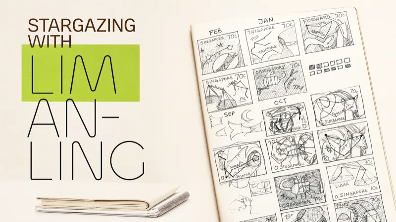
A lot of thoughts has been put into developing the design and concept for this set of stamps, while the technique is kept relatively straightforward and traditional. The main design is done from pencil drawings. As usual, I made thumbnail sketches of the whole set to make sure that the design concept is consistent throughout the twelve stamps, then construct the necessary detailed drawing in pencil, before filling in the colours on the computer.
What are the concerns / challenges you faced when designing and how did you overcome it?
I find the design brief for this set of stamps challenging as it requires the constellations of the twelve stars signs to take prominence in the design. Typically when you think of the twelve horoscopes, you will think of the ram for Aries, the lion for Leo, the centaur for Sagittarius and so on. These mythical figures provide instance recognition and they are visually attractive.
Thinking through, I decided to keep the mythical figures in background, as decorative wall papers. To make the constellations stand out on the design, the colours of the background is also toned down to the minimum. And finally, I believe what crowns the design, is the application of the specific printing effect suggested by the SingPost (Rainbow Silver Holographic Foil). That truly makes it shine.